A numeric textbox works, but a slider may make a score easier to understand. A list of records works, but a card layout may help users find the next action faster. These are the kinds of user experience problems that Power Apps Component Framework (PCF) can help developers solve.
This guide explains PCF control development through a mind map and a practical roadmap, with Dynamics 365 and model-driven Power Apps developers in mind.
What is PCF?
PCF lets developers build reusable code components for Power Apps. A component combines a manifest, TypeScript implementation, and resources such as CSS and localization files. Components can be packaged in Dataverse solutions and configured in apps.
For a C# developer, a useful analogy is a small UI component with a defined contract: the host supplies inputs, your component renders an experience, and it returns outputs when the user changes something. The implementation runs in the client, so keep authoritative business validation in the appropriate server or platform layer.
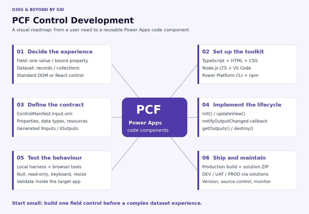
The PCF development mind map
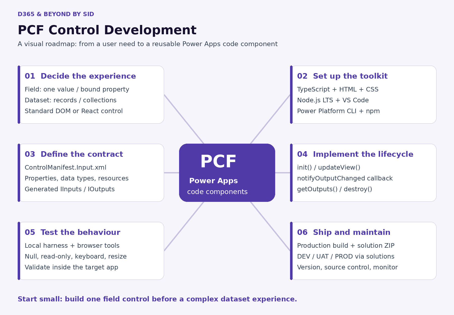
Read the map as six decisions: define the experience, prepare the tools, describe the contract, implement behaviour, test in context, and release through solutions. Coding is only one part of that journey.
1. Choose the right control for the problem
| Choice | Typical use | Example |
|---|---|---|
| Field component | An experience centred on a column value | A satisfaction score rendered as a slider |
| Dataset component | An experience over a collection of records | A card list for open service requests |
| Standard control | Your code creates and manages its DOM within the supplied container | A lightweight HTML input |
| React control | Use the React template and platform libraries; updateView returns a React element | A reusable React-based UI |
Field versus dataset describes the data shape. Standard versus React describes the implementation approach. These are separate decisions.
Start by checking whether an existing Power Apps control already meets the need. A custom component is most useful when the improvement is clear enough to justify development, testing, and ongoing support.
2. Set up a first component
Install Visual Studio Code, a supported Node.js LTS version, and the Microsoft Power Platform CLI. For solution packaging, also prepare the .NET SDK or suitable MSBuild tooling described in Microsoft’s tutorial.
The following commands scaffold a standard field component. They do not implement a finished rating control: you still need to define its property, UI, and behaviour.
mkdir RatingControl
cd RatingControl
pac pcf init --namespace Sid.PCF --name RatingControl --template field --run-npm-install
code .
npm run build
npm start
For a React component, create a separate project using the same initialization command with --framework react. Use the generated React interface and manifest; changing only the manifest’s control type does not convert a standard control into a React control.
3. Treat the manifest as the component contract
ControlManifest.Input.xml defines the component identity, version, configurable properties, and resource files. Choose the property’s data type to match its intended binding.
For a whole-number score, the property could be declared as follows inside the control element:
<property name="rating"
  display-name-key="Rating"
  description-key="Customer satisfaction score"
  of-type="Whole.None"
  usage="bound"
  required="true" />
After changing the manifest, regenerate the types using npm run refreshTypes. Use the generated IInputs and IOutputs rather than manually editing generated files. Your implementation and returned output names must agree with the manifest.
4. Understand the lifecycle and data exchange
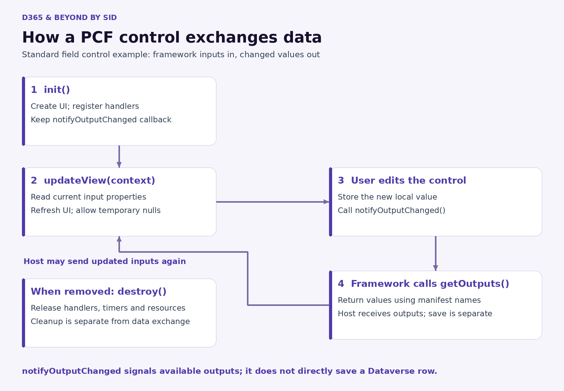
| Method or callback | Responsibility |
|---|---|
| init() | Prepare component resources and keep the output-change callback |
| updateView(context) | Reflect current inputs and host state in the UI |
| notifyOutputChanged() | Tell the framework that changed outputs are available |
| getOutputs() | Return outputs using the property names in the manifest |
| destroy() | Release resources when the component is removed |
For the rating example, the event handler stores the selected score and calls the callback. The framework then retrieves the output. Here is an illustrative fragment, not a complete control:
private ratingValue = 0;
private notifyChanged!: () => void;

// Assign this.notifyChanged = notifyOutputChanged inside init().
private onRatingChanged(value: number): void {
    this.ratingValue = value;
    this.notifyChanged();
}

public getOutputs(): IOutputs {
    return { rating: this.ratingValue };
}
Passing an output to the host is separate from persisting a Dataverse record. Do not treat this callback as a save operation. Also allow for repeated updateView calls and temporarily unavailable input data.
5. Test more than the happy path
Use npm start to open the local test harness and inspect behaviour with browser developer tools. The harness is useful for quick iteration, but it does not reproduce every host capability. Test the component in the actual target app before treating it as ready.
- Empty and null values: what should the user see before data arrives?
- Read-only mode: can the user still change a disabled field?
- Keyboard access: can users reach and operate every interactive element?
- Resizing: does the layout remain usable on narrower screens?
- Multiple instances: do event handlers, element IDs, and styles stay isolated?
- Record changes and navigation: does the component display current data and clean up correctly?
A simple acceptance test for the rating control is: load an existing score, change it, save the form, reload the record, and confirm the stored value and displayed value agree.
6. Deploy with an environment strategy
For a quick development iteration, authenticate to a development environment, verify the connection, and push from the component project folder. Replace the example environment URL with your own.
pac auth create --url https://your-dev-org.crm.dynamics.com
pac org who
pac pcf push --publisher-prefix sid
For controlled releases, package the component in a solution instead. The following example creates a solution project beneath the component project, adds the parent project reference, and builds a release package:
mkdir Solutions
cd Solutions
pac solution init --publisher-name SidSolutions --publisher-prefix sid
pac solution add-reference --path ..
dotnet build --configuration Release
Use publisher details appropriate to your environment. Confirm the solution project’s package type, import the generated ZIP into the target environment, configure the component in the app, and publish the relevant app customizations. Promote validated versions through DEV, UAT, and PROD using your solution process.
For a standalone production component build, use npm run build -- --buildMode production. Keep source, manifest versions, and release notes together so a later fix can be traced to the deployed component.
Practical mistakes to avoid
- Using formContext or changing the host app DOM from inside the component. Keep interactions within supported PCF APIs and the component boundary.
- Calling notifyOutputChanged on every unnecessary UI event, or repeatedly refreshing datasets without a reason.
- Assuming every API works in every host. Microsoft currently documents that Dataverse-dependent APIs, including the PCF WebAPI, are unavailable in canvas apps.
- Putting credentials in client-side code, or using localStorage and sessionStorage to hold component data.
- Deploying a development bundle and postponing accessibility or cleanup work until after release.
A small first project to practise
Build a satisfaction score component for a whole-number column with a defined range, such as 1–5. Decide how blank values should look, provide an accessible input, return the changed score, and honour read-only mode. Then test it on a model-driven form and package it in a solution.
Once that works reliably, add configurable labels or styling. Move to a dataset component only when you have a real requirement involving collections, paging, filtering, or record actions.
Microsoft Learn references
- Code component structure and lifecycle
- Create your first component
- Create and build a code component
- React controls and platform libraries
- Debug code components
- Package and deploy code components
- PCF best practices
- Host limitations and API availability
Technical references checked on 3 October 2026. The diagrams are explanatory illustrations; the code fragments are learning examples.